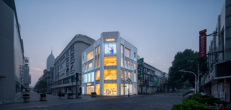
With the development of modern urban life, many old neighborhoods and old buildings need to acquire new vitality. Urban communities also need to find new vitality as the time changes. Recently, DUTS Design commissioned by Balabala unveiled its new renovation project, transforming a four-story old building on Tianjin Binjiang Road into a new experience space “Balabala House” with retail, leisure, events and other functions coming from the architectural facade, interior layout, and business planning.
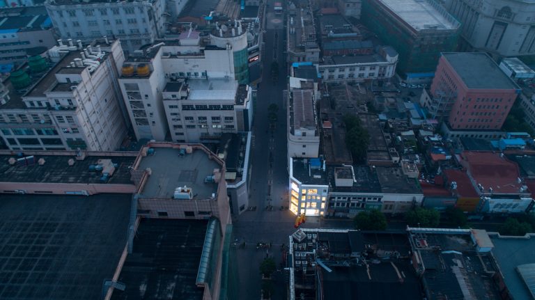
The social significance of architecture: the community “lighted up” by a renewed building
Good architecture brings civilization. The social and humanity carried by architecture not only meet the functional needs of the owners, but also bring practical interaction between architecture and lifestyle. This means that more interactions and dialogues are taking place between urban residents and the city.
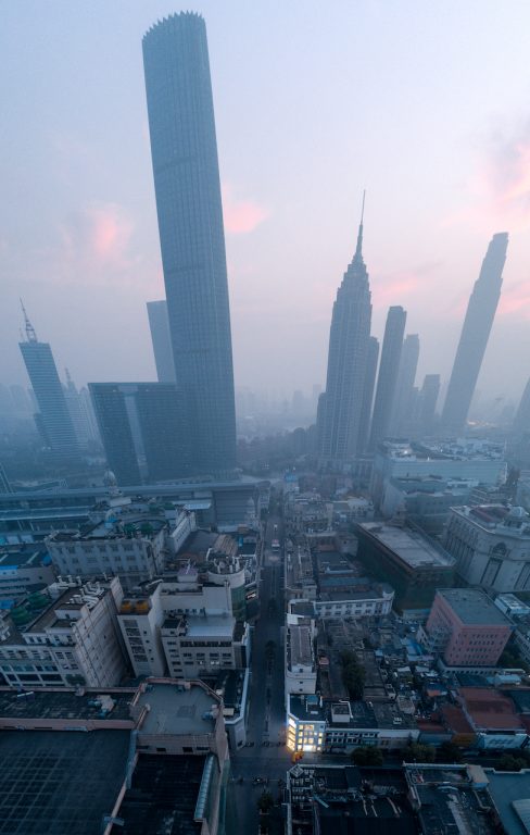
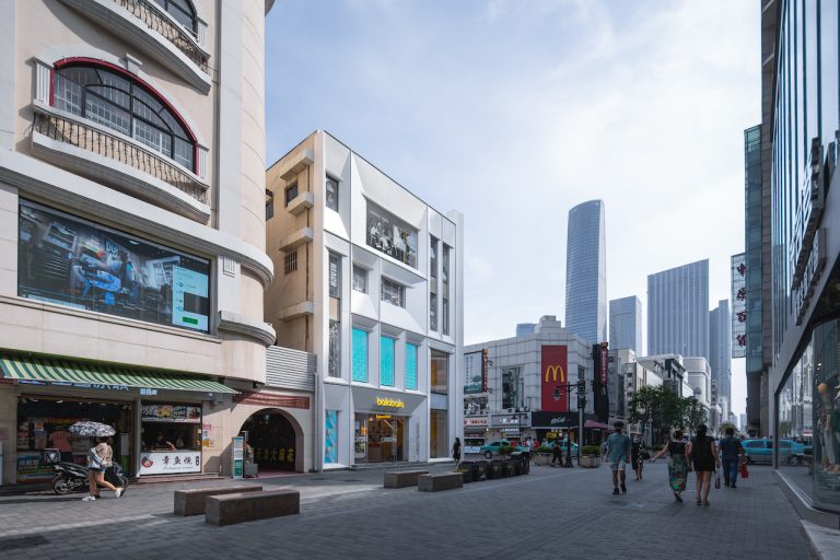
Binjiang Avenue Commercial Street is one of the most prosperous commercial pedestrian streets in Tianjin, witnessing the prosperity of the city. With the rapid update of business models and lifestyles, this neighborhood has undergone several changes under the baptism of time and business.
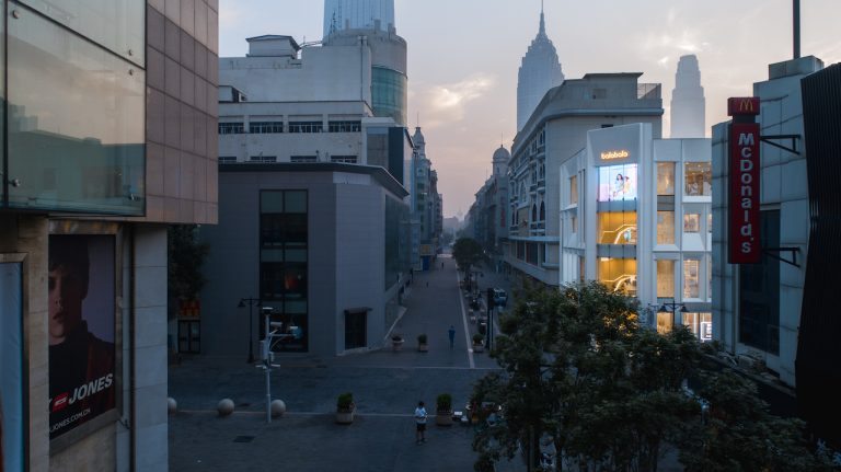
The original building was a four-story building with a V-shaped shape facing two streets,.with almost similar style to the surrounding buildings.“The renovation we have done this time not only makes this building more modern and gives it new vitality. At the same time, the existence of this new building also “lights up” the entire community with a new attitude, adding a new kind of vitality to this relatively old community.” said the architect Zhong Ling, the founder of DUTS Design.

Designers of DUTS Design have carried out an all-round renewal for the owner from the perspective of architectural facade, interior layout, and diversified businesses , presenting a brand-new and vigorous “Balabala House”, which integrates the brand’s cultural IP with the neighborhood. Together. At the same time, this reconstructed building has also become the core and leader of neighborhood revitalization.
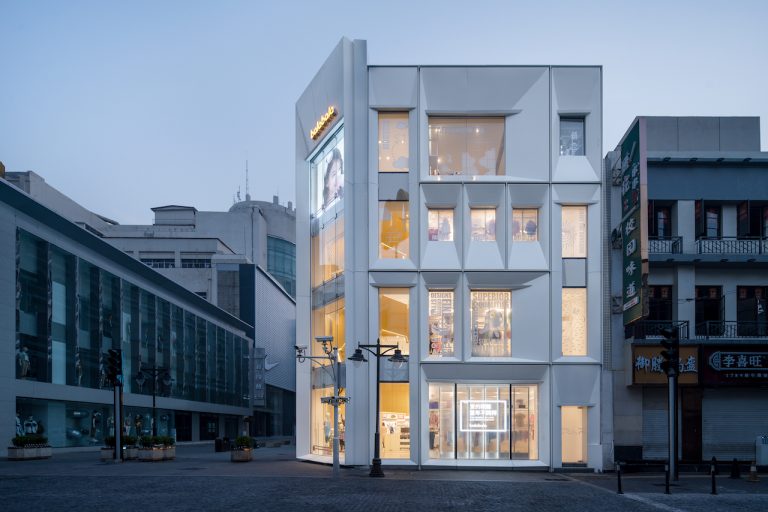
Renewed architectural facade: “Let the light lead the children to see a different world”
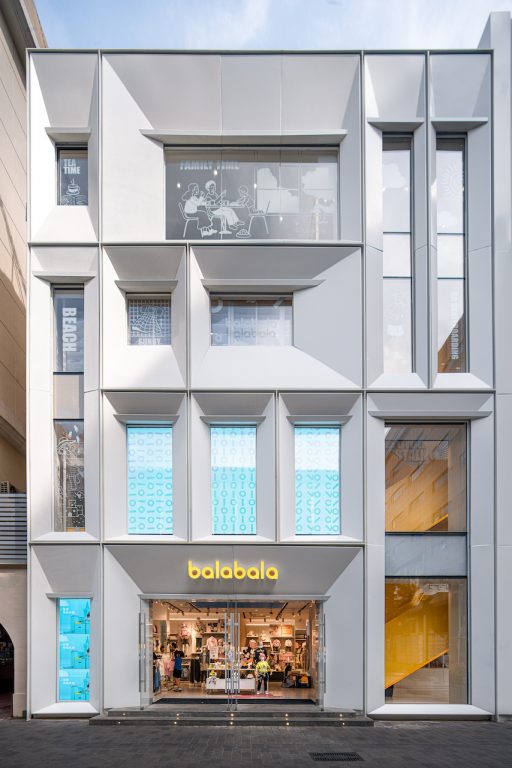
The designer retained the original building outline and charm, and simplified the facade lines to make it more modern. The color tone is white with a sense of technology, which is more modern based on the integration of the gray and white tones of the surrounding blocks.
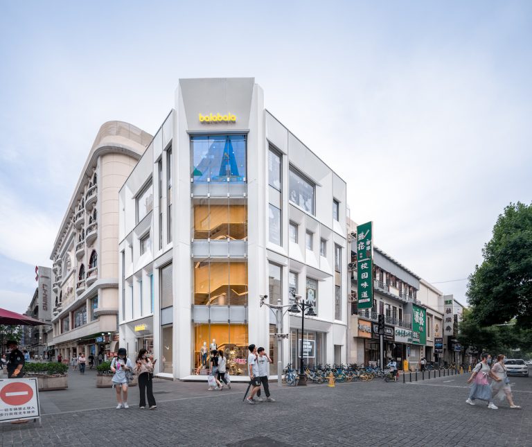
The designer breaks up and reorganizes the square windows of the original building to increase the artistic sense of abstraction. The obliquely cut and recessed square windows of different angles and proportions also bring multiple lights, shadows and depth to the entire building’s facade.
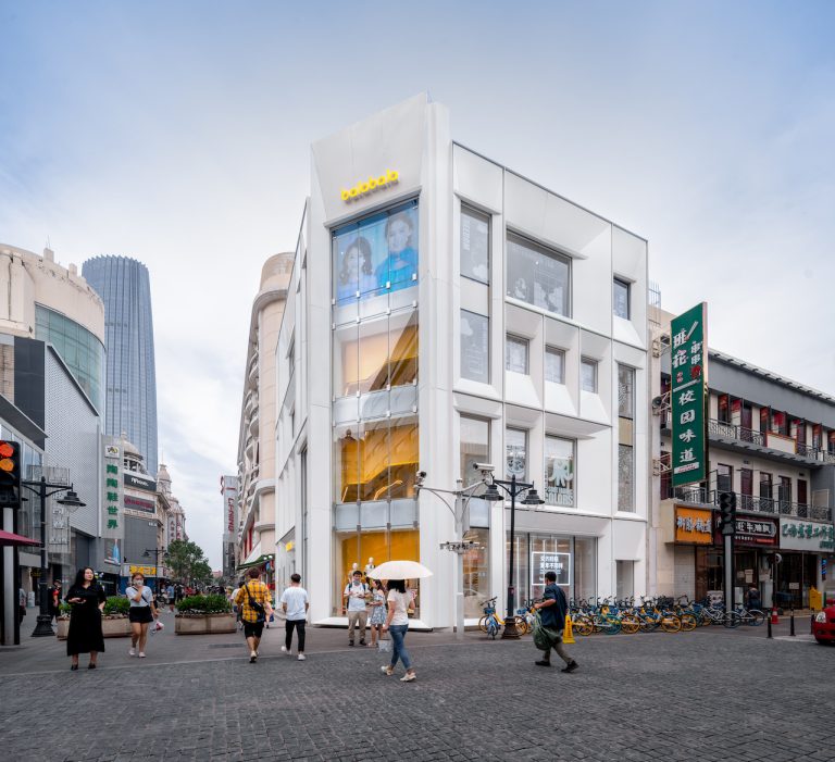
Renewed interiors: transforming the pain points of the space into cultural IP of the brand
The original space was a traditional gold jewelry shop, so although the main entrance of the building faces the intersection where people and vehicles gather, the overall facade is relatively enclosed and private. Doors and windows openings are relatively narrow, which is no longer suitable for the increasingly opened and shared commercial space and the diversified development of children’s businesses.
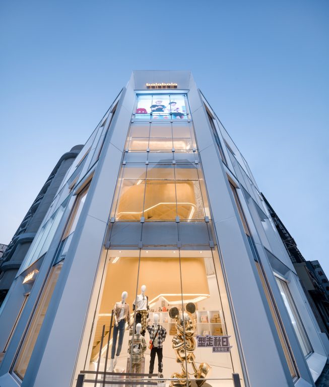
The designers transformed the original entrance facade into a double-sided visible floor-to-ceiling glass curtain wall, introducing more natural light into the space. It greatly enhances the sense of transparency and ingeniously solves the disadvantages of poor lighting effects and narrow space in the original old building, bringing more comfortable feelings to consumers inside it.
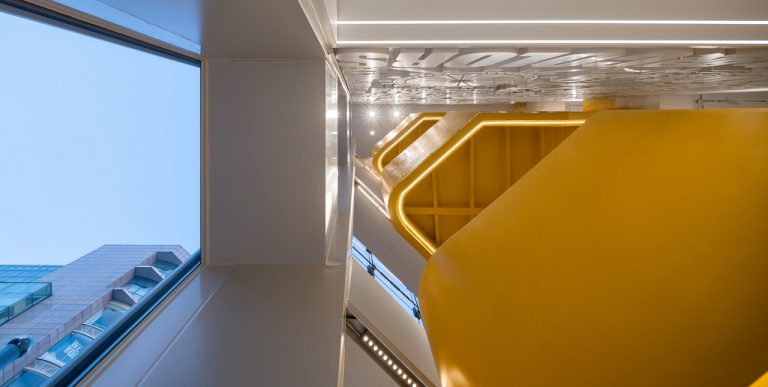
The original staircase in the building is a single run on each floor, hidden in the floor plan layout, occupying a lot of space, and not meeting the needs of business circulation density. The designers use clever mechanics and structural design to separate the stairs from the surrounding wall supports, forming a four-story accessible “cantilever staircase” at the entrance of the space.
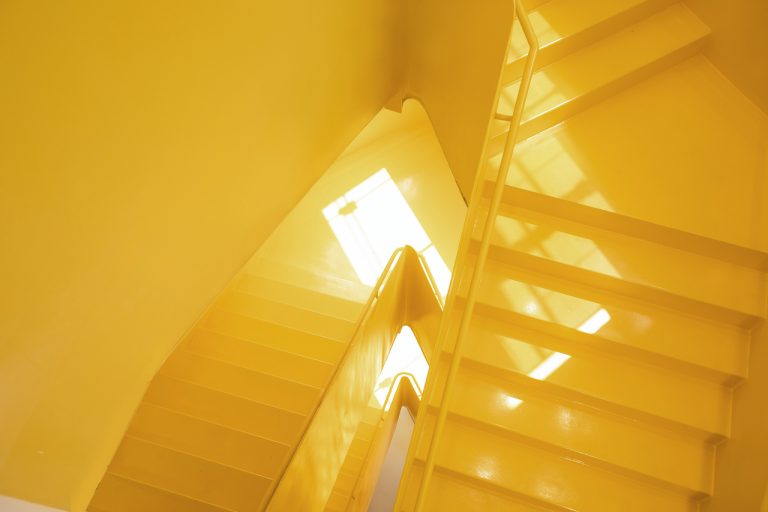
Based on the lightness of the visual form, a large amount of indoor space is released. Based on the concise color scheme of the space, the designers matched the “cantilevered staircase” at the entrance with the bright yellow of the Balabala brand, which leads directly to the top floors. This has become the most impactful visual element in the space.
Visual communication is quite crucial for modern business. When people enter this space, they are all attracted by such powerful visual effects leaving a deep impression on the brand’s image of Balabala
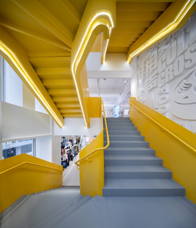
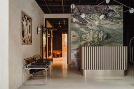
On the right side of the entrance, the architects designed the entire cultural “relief wall”, which presents the cultural characteristics of Tianjin with interesting text combinations. “When we designed the staircase renovation, we considered people’s movement and sight when going up and downstairs. Originally, when going up and downstairs, people’s sight range is at the back of the display racks, which is not beautiful enough. So, we had a sudden inspiration and included the “relief wall” full of Tianjin cultural characteristics that can bring a good visual experience to the customers and create a better cultural link between the space and the region.”
The connection with the local culture is very important for the space. As a parent-child space, how can our next generation feel the cultural characteristics of Tianjin more intuitively? We have chosen a contemporary and interesting visual way to increase the emotional connection. We hope that children can feel the cultural characteristics of Tianjin, and can “dream together” and grow together with the city.
Renewal of Retail business:Complex offline experience + online digital communication
The total area of the four floors of the project is 614 square meters. In addition to the traditional retail business, the designers also made a brand-new business layout and planning for the “Balabala House”, making it a new type of complex experience space with multiple functions such as retail, events, conferences, and lectures. After many analyses and attempts on the spatial pattern, the well-designed crowd movement can satisfy the diverse play and shopping experience of children of different ages and adult customers.
With the development of digitalization and new retail, more online and offline interactions have also become a demand for new commercial spaces. In the brand-new flagship store of Balabala Tianjin, a digital live broadcast room was also innovatively added to allow more consumers to simultaneously conduct space “cloud exploration” and get more surprise experiences through digital communication.
The epidemic has quickly jumped us to a ‘cloud era’, which puts on the table higher requirements for offline business scenarios. When we planned this space, we considered more experience scenarios. We also considered more connections with regions, cultures, and people’s daily lives. After the completion of this project, we also saw the vitality and enthusiasm it brings to the neighborhood. As a company, we feel a sense of social responsibility. This can be regarded as a “gift” for Tianjin Binjiang Road.”
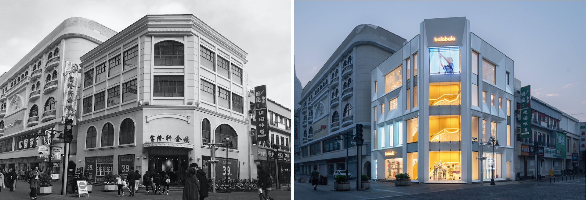


Comparison before and after
People still come and go on the bustling Binjiang Road, and the renewed buildings bring new experiences and stimulate the vitality of urban residents. Cities are evolving and renewing in a more “organic” way. New cultures and lifestyles are added to jointly create a more vibrant urban form.
Location: Binjiang Avenue, Tianjin, China
Client: Balabala, Semir Group
Area: 614 sqm
Date of Completion: July, 2020
Architect studio: DUTS Design
Architect in charge: Ling Zhong
Design Team: Yingqi Hu, Jiangjian Su,Wanggang Shi, Zhe Xiang
Photographs: Qinshan Wu, Yiben Chen
Discuss in Kanban. Welcome to search “艺廊网”, “artthat” and follow us on WeChat and Weibo.
Now join ArtThat Elites Club, then re-create with artists and take silk-screen handwork home!


